TYPOGRAPHY - PROJECT 02

25.10.18 (Week 9) - 31.10.18 (Week 10)
Maisara Arissa Azahari (0332707)
Typography
Project 2 - Font Design
LECTURES
Lecture 9: No lecture given
24.10.2018 (Week 9)
24.10.2018 (Week 9)
INSTRUCTIONS
Project 02 - Font Design (Week 9)
For our second project, we are required to make a font design of our own. Before jumping straight into the project, an exercise was given in order for us to familiarise ourselves with the format of the project. We had to choose an alphabet from our initials and reconstruct it in Adobe Illustrator using perpendicular lines and circles. After that, we then have to choose from the 10 typeface families given to us to be used as the typeface of the one alphabet taken from our initials.
I focused on the first alphabet of my name which is M but I chose a small letter case as it had more circles and I wanted to push my own boundaries.

Figure 1.0 Studies done on the alphabet 'm'
As seen above, I had chosen Futura Std Book to focus on and outline the strokes and circles which make up the alphabet itself. From this exercise, I learned that the alphabet 'm' is not made up of the exact same circles which makes this alphabet to be a little irregular.
Then, we were asked to do studies on 3 alphabets that make up our initials and do the exact same thing to them. After highlighting the alphabets maz which makes up my full name, I decided to jump straight into sketching them out on graph paper.
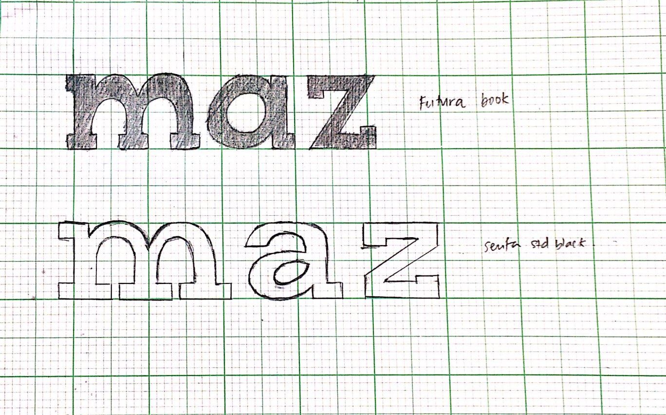
Figure 1.1 Typesketch done
After getting feedback from Mr Vinod regarding the typesketch I made, he commented on how I should digitise the bottom one as its more interesting as compared to the one above. He also pointed out how I should make sure that the 'm' should be drawn more accurately. I decided to straight up digitise it right after.

Figure 1.2 Font design 'maz' finalised
Then, we had to download the software Fontlab to create an actual typeface based off the digitised typesketch that has been made recently.

Figure 1.3

Figure 1.4

Figure 1.5

Figure 1.6
The font file attached below
FEEDBACK
WEEK NINE
Specific Feedback: Mr. Shamsul said that my animation for blur is simple yet conveys the message well. However when it comes to the animation quality, he said that I should have more frames for a smoother look but the movement of the word has to be quick.
Specific Feedback: Mr. Shamsul said that my animation for blur is simple yet conveys the message well. However when it comes to the animation quality, he said that I should have more frames for a smoother look but the movement of the word has to be quick.
REFLECTION
Experiences
WEEK NINE
We learned how to understand more in depth on how a font is created using circular strokes and straight lines. I discovered that a font does not necessarily have to be made up of perfect circles and could be made up of a lot of straight lines.
We learned how to understand more in depth on how a font is created using circular strokes and straight lines. I discovered that a font does not necessarily have to be made up of perfect circles and could be made up of a lot of straight lines.
Observations
WEEK NINE
I noticed that class was way more laid back than it was last week as we just had to play around with circles and straight lines to construct a letter. We were also given a lot of guidance and clear instructions.
Findings
WEEK NINE
I find that it was intriguing to see how a font is created directly from scratch just by putting a few circles and straight lines together to create a letter. Other than that, constructing my own font seemed to be easier after doing the exercise given in class.
Further Readings
Further Readings
WEEK NINE
Draw Your Own Fonts: 30 Alphabets to scribble, sketch and make your own
by Tony Seddon
Drawing and Scanning Fonts
There is no prescribed method, but there are a couple of things you can do to help ensure impressive results. First of all, use good quality paper with a smooth surface that won't snag your pen as you draw. Also, try to use paper that has a low absorption level so it doesn't ruck up and distort the letterforms when you use pen and ink. It's worth experimenting with a few different types of stock to find one that suits you the best. Secondly, use the right drawing tool for the style of lettering you want to create. Sketching letterforms with a pencil before working over the top with a pen or marker is a good way to start, but if you want something calligraphic try using a calligraphy pen straight away. Fine-liners are great for inking over pencil and flow nicely over the paper surface for smooth curves and lines; and if you want a marker pen for heavier line work, look no further than a good old Sharpie.
You can scan originals as a black and white bitmap immediately, given that ultimately your characters have to consist only of solid areas. You don't want any shades of grey in there as we're going to turn these characters into vectors next. However, I would recommend scanning as a greyscale first in order to collect as much detail as possible, followed by a clean-up prior to the vector drawing stage. Go for a high-resolution setting on your scanner, certainly no lower than 300dpi. I normally scan line work at 600dpi to ensure I pick up every detail.
Once you've completed scanning, open up the images in image-editing software such as Photoshop elements to check for unwanted detail. The easiest way to remove stray specs and lines is to use the Levels Adjustment (Enhance > Adjust > Lighting > Levels) to adjust the contrast, making the whites whiter and the blacks blacker. You can't adjust the contrast of a bitmap, hence my advice to start with a greyscale scan. Once you're happy, you're ready to start drawing your character.
Comments
Post a Comment