DESIGN PRINCIPLES - EXERCISES

Maisara Arissa Azahari (0332707)
Design Principles
Exercises
Lecture 1: Module Briefing/Contrast
27.08.18 — Week 1
The class was commenced with a brief introduction to the module and then it was proceeded with our first lecture on one of the design principles, Contrast.
- Contrast simply refers to the arrangement of opposite elements (colours, shapes, sizes etc.) to create a visual interest.
- Contrast creates focus, which is important in order to grab the viewer's attention.
- It is interesting to note that these examples have similarities between them, despite coming from different artists and in different times.

A magazine cover by H.N Werkman, a Dutch artist (left) and A novel cover by Chip Kidd, and American graphic designer
After the lecture, we were then told to bring the materials needed for our exercise which is to create a visual contrast based on the lecture that was given. It is important to note that we were limited to only using pencils, pen or marker on a piece of A4 paper.
Right after that, there was an ice breaking session to get the class to get to know each other better. We were given a piece of paper with random questions about ourselves which is then supposed to be exchanged with a partner. Attached below is my piece of paper which is a product of the ice breaking session.

Figure 1.1
The end product and a portrait drawn by my chosen partner.
In class, I was a little overwhelmed by the amount of ideas shown in the slides by our lecturer. I was torn between choosing a subtle approach to the topic or a more minimalistic one. After doing my fair share of brainstorming and researching on either Tumblr or Pinterest, I settled on combining both of the ideas. My final idea was inspired heavily on the concept of photomanipulation.
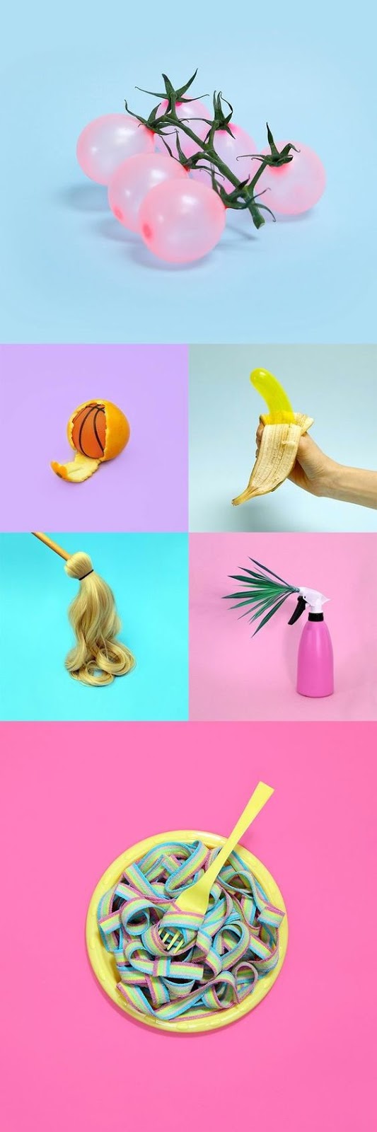
Figure 1.2
Examples of photomanipulation showing stark contrast.
(Pictures by Dan Cretu)

Figure 1.3
More examples that I have gathered and was inspired by.
DESIGN FINAL

Figure 1.4
My final piece, titled 'Cheely'
FEEDBACK
Ms Sherry appeared to have liked my art piece although she pointed out that it resembles the Gestalt principle. The only contrast that was pointed out were the colours and the thickness of the line strokes.
Lecture 1: Gestalt Principles
This week's lecture was on Gestalt. In a nutshell, Gestalt refers to a unified whole based on its psychology term. It is the way in which humans tend to look at a group of objects as a whole before seeing its individual parts. The principles of Gestalt include similarity, continuation, closure, proximity, and figure/ground.
- Similarity happens when objects look similar to one another, that they are perceived as a group.
- Continuation is the principle through which the eye is naturally drawn along a path or line, to see a single continuous figure.
- Closure occurs when an object is incomplete or a space is not completely enclosed.
- Proximity happens when objects are placed together and are perceived as a group.


Figure 1.5
Examples of Gestalt
DESIGN PROGRESS

Figure 1.6
1st attempt at Gestalt exercise

Figure 1.7
2nd attempt at Gestalt exercise
To begin this exercise, I had done a lot of research and some light reading on the Gestalt principle online to get a deeper understanding of it before applying it onto my artwork. After saving a few pins on Pinterest and skimming through a few websites, I had a rough idea of using two faces as my main object. Since Gestalt is all about unified forms and 'seeing two in one' I thought this would be enough but unfortunately Ms Sherry pointed out that it was not quite Gestalt. So I whipped out the black and white papers yet again and went to work.
DESIGN FINAL

Figure 1.8
Final outcome for Gestalt exercise
Lecture 3: Symmetry, Asymmetry, Balance and Dominance
- Symmetry is the quality made up of exactly similar parts facing each other around an axis


Figure 1.9
Samples of symmetry
- Asymmetry is the lack of equality or equivalence between parts or aspects of something

Figure 2.0
Sample of asymmetry
- Balance is a feeling of equality in weight, attention, or attraction of the various visual elements within the pictorial field as a means of accomplishing organic unity
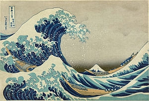
Figure 2.1
Sample of Balance
Dominance is the principle of visual organisation suggesting that certain elements should assume more importance than others in the same composition

Figure 2.2
Sample of Dominance


For this assignment, we are required to create an artwork based on all of the principles that have been presented in the lecture. I decided to recreate my collage artwork with all the principles included in it.


For this assignment, we are required to use our photography skills to show either one of the principles mentioned above. I had decided to put my low shutter speed manual skills to use and ended up photographing my cousin playing the piano to capture the essence of movement.

Figure 4.3 Final photograph showing movement


For this assignment, we are free to use any techniques and media that we used on the previous topics. I searched up artworks on shapes to get inspiration from and found a particularly interesting artist, Romero de Brito, that had made use of shapes throughout all his artworks.


We were given the freedom to choose from these four principles to make an artwork out of. When the lecture was given, the moment one of the group members introduced the principle of Symmetry to the class, I already had an idea in mind. The idea stemmed directly from watching numerous TV show genres with psychology and crime undertones. In short, the idea was derived from the Rorschach test (Figure 2.3) in which subjects' perceptions of inkblots are recorded and then analyzed using psychological interpretation, complex algorithms, or both.
Using interpretation of "ambiguous designs" to assess an individual's personality is an idea that goes back to Leonardo da Vinci and Botticelli. Interpretation of inkblots was central to a game, Gobolinks, from the late 19th century. Rorschach's, however, was the first systematic approach of this kind. The ink blots were hand drawn by Rorschach
Using interpretation of "ambiguous designs" to assess an individual's personality is an idea that goes back to Leonardo da Vinci and Botticelli. Interpretation of inkblots was central to a game, Gobolinks, from the late 19th century. Rorschach's, however, was the first systematic approach of this kind. The ink blots were hand drawn by Rorschach
Figure 2.3
Examples of Rorschach test inkblots
Initially, I wanted to directly apply the watercolour paint on the watercolour paper itself but I noticed that the paper absorbed the paint quickly and it also dried up in a second. I looked up ways on making the inkblot test at home with materials that were already lying around waiting to be used. After several tries, I finally settled with this design. I had recycled a plastic bag from a trip to the shopping mall and decided to use that as my primary material before pasting it onto a watercolour paper.
Besides that, I also created a second artwork (Figure 2.5) which was based off an impulsive decision: My haircut. The significance of the colour blue in this context is important as it shows the emotional turmoil that I am currently under. Meanwhile, the vermillion cheeks and lips represents the anger issues and how badly I try to keep it all in before I burst.
DESIGN FINAL

Figure 2.4
First outcome of Symmetry exercise

Figure 2.5
Final outcome of Symmetry exercise
Lecture 4: Pattern, Repetition, Texture and Surface
- Pattern is the repeating of an object or symbol all over the work of art
- Flow follows the path of least resistance

Figure 2.6
Flow relating to a waterfall, river, and even the flow of music
- Branching follows the form of patterning in the plant world, but can also be seen in geological formations
Figure 2.7
Branching relating to a plant
- Spiral patterns can be seen from the scale of galaxies to the opening of fiddlehead buds of ferns, to the forms of microscopic animals
Figure 2.8
Example of spiral patterns
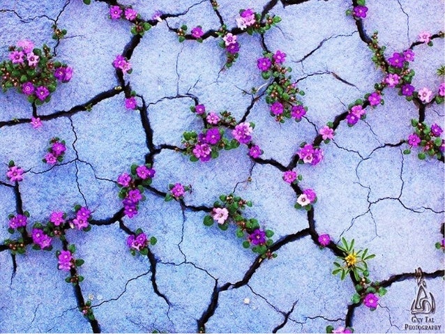
- Packing and Cracking refers to the way in which compacted cells define others shape
Figure 2.9
Example of packing and cracking
- Repetition is simply repeating a single element many times in a design
- It simply means reusing the same or similar elements
 Figure 3.0
Connected or pictorial elements
Figure 3.0
Connected or pictorial elements
 Figure 3.1
Regular or irregular, even or uneven
Figure 3.1
Regular or irregular, even or uneven
 Figure 3.2
Gradation
Figure 3.2
Gradation
- Texture is the quality of an object which we can sense through touch
- We can see, and imagine the sensation we might have if we feel it
 Figure 3.3
Example of a bristly, rough and hard surface
Figure 3.3
Example of a bristly, rough and hard surface
- Surface is the outermost/uppermost layer of a physical object/space
- Any type of median is applied
 Figure 3.4
Wood surface
Figure 3.4
Wood surface

DESIGN FINAL
For this exercise, we were given the task of creating a pattern using a texture. Any type of objects that had a texture was encouraged for us to use to create them. After scrolling through Pinterest and watching a few videos on Youtube about creating patterns, I had an idea of using bubbles and watercolour to create a pattern that is on the irregular side.

Figure 3.5
Final outcome made out of blowing bubbles in a cup mixed with dishwasher soap and watercolours
Lecture 5: Alignment, Hierarchy, Placement, Direction
- Alignment can be divided into 3 types which is Edge alignment, Center alignment, and Visual and Optical alignment
- Hierarchy refers to the arrangement or presentation of elements in a way that implies importance
- Placement refers to the change and position of shapes or objects that can affect the visual depth and composition of an artwork
- Visual direction is practically leading the eye towards a particular direction, or how you want the audience to look at the artwork
DESIGN FINAL
For this exercise, we were given the task of creating a collage based on what have been presented in the lecture. After doing a thorough research on collages that had bright colours in them and also cutting out the pieces I wanted to use. Although I did not get all of the pieces I wanted, I had to make do with things that I found.
Below are the examples that inspired my own.
 Figure 3.6
 Figure 3.6
 Figure 3.7
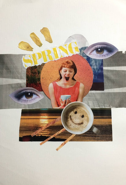 Figure 3.8 Final artwork on collage
Inspired heavily by spring and how it signifies the rebirth of nature. I wanted to show the rebirth of a human from a routine filled life to connecting with nature and taking in what life has to offer.

Lecture 6: Dots, Lines, Size and Scale
- Dots are the smallest and most basic element of graphic design. Two dots imply a structure. As dots get closer together they start to get seen as an object
- Lines are divided into four: Straight and curved lines. Short and tall line
- Size refers to how big or small an element is in relation to another object. The relationship of an area occupied by one space to that of another
- Scale is the size of an object (a whole) in a relationship to another object (another whole) In art, the size relationship between an object and the human body is significant
DESIGN FINAL

Figure 3.9 Final artwork on Dots, Lines, Size and Scale
Lecture 7: Rhythm, Movement, and Harmony
This topic in particular is quite different from the rest as you would normally associate rhythm and harmony to music. However, it does not stray away from a designer's perspective. Meanwhile, movement is usually related to something that moves but in this case it relates to an element that is portraying the movement.
- Rhythm is repetition or patterns. A pattern has rhythm but not all rhythm is patterned. For example, the colours of a piece might have a rhythm if it makes your eyes travel from one colour to another.
Figure 4.0 Example of rhythm
- Movement is the design element that operates in the fourth dimension which is time. Movement itself is the relocation of objects in space over time. We can speak of movement as either literal or compositional.
Figure 4.1 Example of movement
- Harmony refers to the visually satisfying effect of combining similar, related elements. For instance, adjacent colours on the colour wheel, similar shapes, etc.

Figure 4.2 Example of harmony
DESIGN FINAL

Figure 4.3 Final photograph showing movement
Lecture 8: Shape, Form, Figure and Ground
- Shapes are like the brains attempt at resolving an object object as recognisable to one's experience. Shapes can be realistic or abstract.
Figure 4.4 Examples of shapes
- Forms give dimensions, volume, texture, and space. Can be done by adding lines, tones, or colour.
Figure 4.5 Examples of forms
- Figure and ground is almost similar to gestalt principles. Figure is the first object that we see in an artwork, while the other area is called the ground.
- 3 types of figure and ground:
- Stable
- Reversible
- Ambiguous
Figure 4.6 Examples of 3 different types of figure and ground
DESIGN FINAL
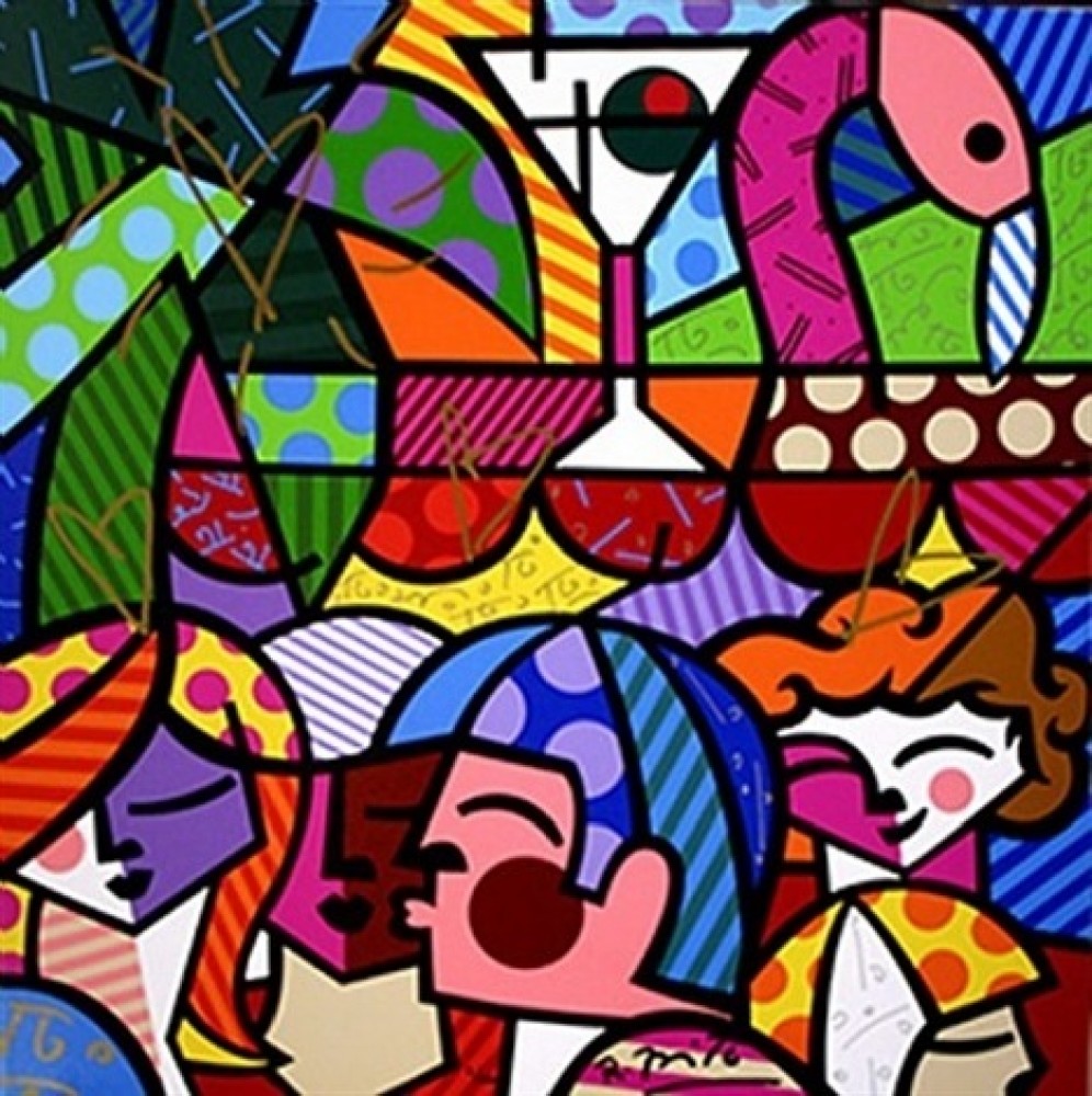
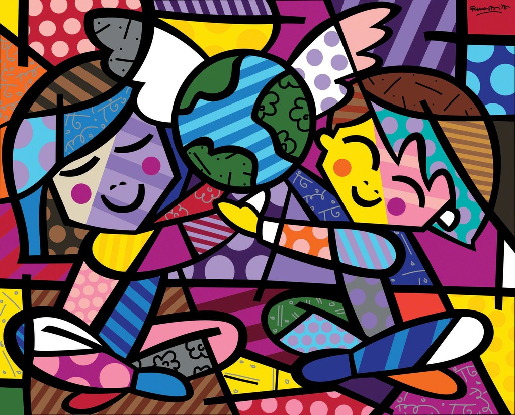
Below are the examples of artworks done by Romero de Brito that heavily influenced my own.
Figure 4.4 Happy Cat and Snob Dog by Romero de Britto
Figure 4.5 News Cafe by Romero De Britto
Figure 4.6 Children of The World by Romero De Britto
Other than that, I was also really attracted to this particular piece by Lynn Johnston.
Figure 4.7 Shape art by Lynn Johnston
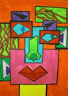
After researching enough artworks relating to shape, that were leaning more towards abstract rather than realistic, I finally came up with my own artwork of a face made out of various shapes and patterns.

Figure 4.8
Comments
Post a Comment