DESIGN PRINCIPLES - PROJECTS

27.08.18 (Week 1) - ...
Maisara Arissa Azahari (0332707)
Design Principles
Projects
Project 01 - Self-portrait
WEEK 8
A project on self-portrait was given to us.We were free to use any kind of techniques and mediums relating back to what we have used before in either an A3 or A4 size. For this particular project, we had to basically represent ourselves through the artwork we do. The artwork is all up to us whether or not we want it to be realistic or abstract. I brainstormed a little by looking at my old photos that I took last year where I had shorter hair and more masculine features that highlighted my jawline and cheekbones.
After that, I moved on to Pinterest and Tumblr to search for more inspiration on doodling on a photograph, making it more fun and lively rather than just a static photograph of myself. I stumbled upon a few pieces that resonated really well with how I perceive myself. Attached below are the pieces that eventually inspired my own.


After the brief, I went on to choose a coffee shop named Coffea Coffee situated in SS15 that I went to a few months ago which interior design really sparked an interest in me. They had coffee makers such as coffee bean grinders and filters which gave an overall vintage yet modern feel to the place.
Here are the pictures that I took when I went to have a look


After that, I moved on to Pinterest and Tumblr to search for more inspiration on doodling on a photograph, making it more fun and lively rather than just a static photograph of myself. I stumbled upon a few pieces that resonated really well with how I perceive myself. Attached below are the pieces that eventually inspired my own.

Figure 1.0

Figure 1.1

Figure 1.2

Figure 1.3
DESIGN FINAL

Figure 1.4 Final design of my artwork, consisting of lines, patterns and shapes
For this artwork, I had decided to use an old picture of mine where I had shorter hair where people would often mistake me for a Chinese or Korean boy (This is coming straight from their mouths themselves and not me trying to uplift myself) Currently, I have longer hair with bangs which makes me look prominently more feminine as oppose to the older picture as you can see above.
Moving on to the solid colours that I have decided to put into the artwork, the blue and pink symbolises how I interchange between masculine and feminine a lot. It also represents how I can't choose only one gender expression that feels like myself so I tend to fluctuate a lot in those terms. The red lipstick lines that I had decided to draw on emphasises on how I am trying to embrace my feminine side nowadays by buying lipsticks among other makeup products to accentuate my features. Lastly, the collage of sentences that decorates the background shows how much I tend to overthink and also the words that come out of other people's mouth that I have let influence my everyday decisions in life.
Project 02 - A Sense of Place
WEEK 9
For this project, we need to identify a place such as a coffee shop, a clothing store or any places
that we frequently visit. After that, we need to take some photos of the shop and then compile it into a picture using any method. We can use any method to complete this project, either digitally or hands on such as collaging, painting or even drawing. The main objective of the project is to show the elements and feel of the place that we chose.
that we frequently visit. After that, we need to take some photos of the shop and then compile it into a picture using any method. We can use any method to complete this project, either digitally or hands on such as collaging, painting or even drawing. The main objective of the project is to show the elements and feel of the place that we chose.
After the brief, I went on to choose a coffee shop named Coffea Coffee situated in SS15 that I went to a few months ago which interior design really sparked an interest in me. They had coffee makers such as coffee bean grinders and filters which gave an overall vintage yet modern feel to the place.
Here are the pictures that I took when I went to have a look

Figure 1.5

Figure 1.6

Figure 1.7

Figure 1.8

Figure 1.9

Figure 2.0

Figure 2.1
DESIGN FINAL

Figure 2.2
As you can see from my final piece, I decided to put focus on both the coffee and the jars where the coffee beans are kept in. I wanted to show how the coffee shop is really known for its grinded coffee beans to make their coffees rather than it being an instant mix.
FINAL PROJECT
WEEK 8
The description of the final project for this course is as below:
Let’s investigate the print culture around us. Wherever we go, we see billboards: on buildings, on roadways, on elevated sidewalks. They are of different sizes, orientations, purposes. They all have been designed.
Visually research billboards then select two or more that advertise the same product. If possible, drive by at various times of the day/night. Can you read them before you are past? How are they different or the same? Document their location, describe the area, the highway, the size/proportion of the billboard. What are they promoting? Do you find them successful? Are they easy to read while driving? Explain any and all of your reactions to the overall impact as well as to the various details. Can you identify the designer/design company? Where are they from? Is the market local or international? What principles of design are being used? List colors used, type of image/s, amount of text, i.e. analyze all of the graphic aspects of at least two billboards for the same product. Are they equally effective? Why/why not. Compare/contrast.
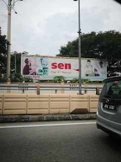
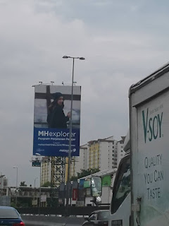
Before jumping into the idea that I have formed in my head, I went on to take pictures of the billboards around the Sunway area. Attached below are the billboards that I have managed to take pictures of:


Let’s investigate the print culture around us. Wherever we go, we see billboards: on buildings, on roadways, on elevated sidewalks. They are of different sizes, orientations, purposes. They all have been designed.
Visually research billboards then select two or more that advertise the same product. If possible, drive by at various times of the day/night. Can you read them before you are past? How are they different or the same? Document their location, describe the area, the highway, the size/proportion of the billboard. What are they promoting? Do you find them successful? Are they easy to read while driving? Explain any and all of your reactions to the overall impact as well as to the various details. Can you identify the designer/design company? Where are they from? Is the market local or international? What principles of design are being used? List colors used, type of image/s, amount of text, i.e. analyze all of the graphic aspects of at least two billboards for the same product. Are they equally effective? Why/why not. Compare/contrast.
Before jumping into the idea that I have formed in my head, I went on to take pictures of the billboards around the Sunway area. Attached below are the billboards that I have managed to take pictures of:

Figure 2.3

Figure 2.4

Figure 2.5

Figure 2.6

Figure 2.7

Figure 2.8

Figure 2.9

Figure 3.0

Figure 3.1

Figure 3.2
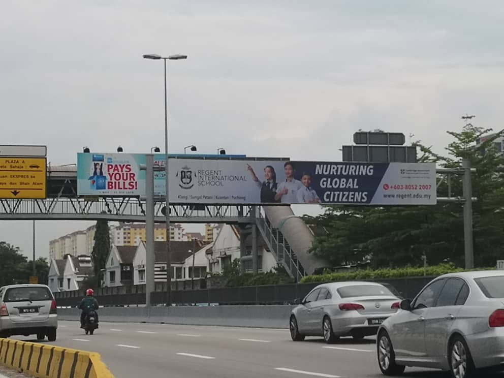
Figure 3.3

Figure 3.4

Figure 3.5

Figure 3.6

Figure 3.7
After taking a lot of photos and observing the certain use of colours of the billboards around Sunway, I noticed that some of them had incorporated the use of typography, alignment and collage. Other than that, some of them had also tend to be too 'in your face' and not at all subtle especially using a bright colour which will not only distract the road drivers but also cause accidents on the road. Moving on, I had also formed a solid opinion on the use of billboards and how it affects a person's mindset and how it is too 'in your face' and will not only manipulate the way a person think but it will also be too overwhelming.
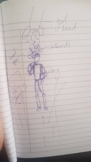
I sketched out my idea so it could be understood better and so that I can use it as a base for my piece.

Figure 3.8 My idea visualised on paper
In short, the figure represents people in general while the 'God hand' plays a role in the companies and government controlling the minds of people with all the unsolicited billboard advertisements that are mostly shallow which takes over their mind. This in return will make it seem as if the billboards take over a person's mind and shape the way they think.
Attached below are extra references that I used to create my artwork:

Figure 3.9 A view of the pose the person will be in

Figure 4.0 Another view of the pose the person will be in

Figure 4.1 The final reference for the photo used

Figure 4.1 The position of the "God hand"
DESIGN FINAL

Figure 4.2 Final outcome
Comments
Post a Comment