TYPOGRAPHY - PROJECT 01

10.10.18 (Week 7) - 25.10.18 (Week 9)
Maisara Arissa Azahari (0332707)
Typography
Project 1 - Text Formatting and Expression
LECTURES
Lecture 7: Text / Tracking : Kerning and Letter spacing
10.10.2018 (Week 7)
For this week, a lecture was given to make us understand better and do well on Project 1 - A Story Book. Its all about formatting text with kerning and letter spacing.
Terminologies
- Kerning: the automatic adjustment of space between letters.
- Spacing: to give space between letters.
- Tracking: the addition or removal of space in a word or sentence.
- Leading: the distance between 2 lines of type.
- Line Length: the distance between the left and right edges of text block.
- Type specimen book: samples of typefaces in different sizes.
Type size, leading, and line length affect the readability of a text. The size should be. large enough to be read from arm length, not to make the leading too tight, and to keep 35-65 letters each line.
- Kerning
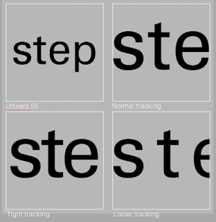
Fig 1.0 Types of Kerning : Normal (top right), Tight (bottom left), Loose (bottom right)
- There are 4 types of text formatting =
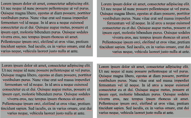
Figure 1.1 Types of text formatting : flush left (top left), flush right (top right), entered (bottom left), and justified (bottom right)
After the lecture, we were given some shortcuts and tutorials on working with Adobe InDesign.
INSTRUCTIONS
Project 01 - Text Formatting and Expression (Week 7)
For our first project, we are required to create a booklet and express the content of "First Things First Manifesto 2000" ( http://www.eyemagazine.com/feature/article/first-things-first-manifesto-2000) typographically, with no images involved.
On our first week working on Project 1, we were introduced to Adobe InDesign in depth by Mr Vinod. We were asked to copy and paste the article into 4 different formats which are justified, left alignment, right alignment, and centered. We can choose our own typefaces based on the 10 type families given earlier and also decide the size of our preferred columns.
 Fig 2.0 Final left alignment format
 Fig 2.1 Final right alignment format

Figure 2.2 Final center alignment format
 Figure 2.3 Final justified alignment format
10.10.2018 (Week 7)
For this week, a lecture was given to make us understand better and do well on Project 1 - A Story Book. Its all about formatting text with kerning and letter spacing.
Terminologies
- Kerning: the automatic adjustment of space between letters.
- Spacing: to give space between letters.
- Tracking: the addition or removal of space in a word or sentence.
- Leading: the distance between 2 lines of type.
- Line Length: the distance between the left and right edges of text block.
- Type specimen book: samples of typefaces in different sizes.
Type size, leading, and line length affect the readability of a text. The size should be. large enough to be read from arm length, not to make the leading too tight, and to keep 35-65 letters each line.
- Kerning
 |
| Fig 1.0 Types of Kerning : Normal (top right), Tight (bottom left), Loose (bottom right) |
- There are 4 types of text formatting =
 |
| Figure 1.1 Types of text formatting : flush left (top left), flush right (top right), entered (bottom left), and justified (bottom right) |
After the lecture, we were given some shortcuts and tutorials on working with Adobe InDesign.
INSTRUCTIONS
Project 01 - Text Formatting and Expression (Week 7)
For our first project, we are required to create a booklet and express the content of "First Things First Manifesto 2000" ( http://www.eyemagazine.com/feature/article/first-things-first-manifesto-2000) typographically, with no images involved.
On our first week working on Project 1, we were introduced to Adobe InDesign in depth by Mr Vinod. We were asked to copy and paste the article into 4 different formats which are justified, left alignment, right alignment, and centered. We can choose our own typefaces based on the 10 type families given earlier and also decide the size of our preferred columns.

Fig 2.0 Final left alignment format

Fig 2.1 Final right alignment format

Figure 2.2 Final center alignment format

Figure 2.3 Final justified alignment format
Lecture 7: No lecture
17.10.2018 (Week 7)
After all 4 formats have been completed, we were then asked to select one format for the booklet. I decided to choose the right alignment. On every page, we have to choose a sentence and express them in our own way using the 10 typeface families given earlier. Mr. Vinod also gave lists of designers for us to look and get inspired.
 Figure 2.5 Final attempt on front cover

Figure 2.6 Final attempt of 1st page

Figure 2.7 Final attempt of 2nd page

Figure 2.8 Final attempt of back cover
PDF File: https://drive.google.com/file/d/1Ueg25PwFkTCuK3n740KxNy9W1AjzPCog/preview
Thumbnail spread
Thumbnail images of how it will look like
 Figure 2.9
Lecture 7: No lecture
17.10.2018 (Week 7)
After all 4 formats have been completed, we were then asked to select one format for the booklet. I decided to choose the right alignment. On every page, we have to choose a sentence and express them in our own way using the 10 typeface families given earlier. Mr. Vinod also gave lists of designers for us to look and get inspired.

Figure 2.5 Final attempt on front cover

Figure 2.6 Final attempt of 1st page

Figure 2.7 Final attempt of 2nd page

Figure 2.8 Final attempt of back cover
PDF File: https://drive.google.com/file/d/1Ueg25PwFkTCuK3n740KxNy9W1AjzPCog/preview
Thumbnail spread
Thumbnail spread
Thumbnail images of how it will look like

Figure 2.9
FEEDBACK
WEEK SEVEN
Specific Feedback: Mr. Shamsul said that my animation for blur is simple yet conveys the message well. However when it comes to the animation quality, he said that I should have more frames for a smoother look but the movement of the word has to be quick.
Specific Feedback: Mr. Shamsul said that my animation for blur is simple yet conveys the message well. However when it comes to the animation quality, he said that I should have more frames for a smoother look but the movement of the word has to be quick.
WEEK EIGHT
General Feedback: Mr Vinod reminded us again about the format of our e-portfolio and how we should be aware of the paragraph spacing. Other than that, he also told us not to use underscore to seperate posts, he said to use a page break that can be added in the html section of the blog edit post. Besides that, Mr Vinod also commented on our design cover and sentence expression. He pointed out what does the 1 that I used for my design cover means and how it correlates to the manifesto itself. For the sentence expression, he specifically told me to not focus on every word of the sentence but rather what the sentence means.
REFLECTION
Experiences
WEEK SEVEN
I felt like I had to be more aware of how important typography really is in this class. Typography for me now is defined not only by the aesthetic purpose but also the readability and clarity of it. Overall, it has to be understood by the audience.
WEEK EIGHT
It was difficult creating a sentence expression as we had to express the essence of the sentence itself rather than every word. It was also more difficult for us to do as we had only done expression for one word the week before.
Observations
WEEK SEVEN
Getting introduced to InDesign was a very confusing experience for all of us but by the end of the class we eventually got the hang of it.WEEK EIGHT
It was quite difficult for us to express the sentence properly as we tend to go for visual aesthetics rather than good typography. The whole 6 hours spent in class was spent by us doing the sentence expression.
Findings
WEEK SEVEN
I find that Mr Vinod constantly unloads a lot of information in class that requires constant understanding non-stop. I juggled with taking notes so I took a video of him instead since I work better with visual notes.
WEEK EIGHT
This week seemed to be the most hectic and stressful one for us so far as the majority of us did not understand thoroughly what the project wanted us to do.
Further Readings
WEEK SEVEN - WEEK EIGHT
Basic Alignment Principles in Graphic Design (with Examples)
A design with poor alignment is a little like a poorly organized desk. If you’ve ever had a workspace covered in clutter, you know how frustrating it can be; documents that should go together are nowhere near each other, nothing’s where you expect it to be and the whole thing is just plain unattractive to look at.
Chances are you’ve seen graphic design examples that give you a similar feeling. When the principles of alignment aren’t used properly, it makes marketing collateral look disorganized, haphazard and visually illogical.

This business card is poorly aligned; it’s disorganized and nothing seems to line up with anything else.
Alignment is vitally important in print graphic design because it:
- allows you to arrange elements in a way that matches how people naturally scan the page
- helps balance your image so that it’s visually appealing
- creates a visual connection between related elements
Finding the “invisible line”
Alignment (like the name suggests) is all about organizing elements relative to a line or margin. This doesn’t have to be a literal line in your design; in fact, it’s usually an invisible margin implied by the way your design is arranged.
The two basic alignment principles are edge alignment and center alignment. Each is essentially a different way of utilizing an invisible line.
Edge alignment naturally positions elements against a margin that matches up with their outer edges. This is a quite common technique; even this very article uses edge alignment to keep the text flush against the left margin.

Center alignment places design elements so that they line up with one another on their center axes. Technically every shape has a center axis (though they’re generally easiest to judge on simple, regular shapes).
Note that this doesn’t always mean that elements are placed in the horizontal center of the page. You can place shapes side-by-side or diagonally oriented and still align them on their center axes.

Here’s a redesigned version of our business card from earlier:

By making those “invisible lines” visible, we can see how this design makes good use of both edge and center alignment.
")
Because this business card’s elements are logically aligned, the design is more balanced-looking and easier to navigate. Additionally, the fact that the details at the bottom are aligned with one another helps make it clear that they’re related (specifically, they’re all pieces of contact information).
Common Types of Horizontal Alignment for Text
When dealing with alignment theory, most people immediately think of the horizontal placement of text on a page. This is only a single aspect of the alignment principles, but it’s undeniably an important one since you’ll be dealing with it anytime you work with text.
There are four common types of alignment when dealing with text placement: center, flush left, flush right and justified.

- Centered
A trap that designers sometimes fall into is placing every element on the center axis of the page. While this is a more organized and symmetrical look than placing test haphazardly, it tends to be a pretty weak and easy choice. When your entire page is symmetrical, it often ends up looking boring with no visual interest. Center alignment works best when dealing with just a few short lines of text. You should never use it for full paragraphs because it makes them more difficult to read; the audience has no straight margin so their eyes must move to a new position every time they start a new line.You can add interest to an all-centered graphic design by playing with text shapes, fonts, and colors. Check out the example to the right–the design is centered, but uses different orientations and letter sizes to create the shape of a sword. Just because your text is center-aligned doesn’t mean there’s no room for creativity.As a general rule, if you use center alignment, make sure it’s clear that you’re using it intentionally–not just because you’re lazy.
 Center alignment works best when you only have a few elements to deal with. Try varying fonts and colors to add visual interest.Photo Credit: Tatiana Girman
 Flush Left
Text aligned against a hard left-hand margin is generally considered the strongest, “safest” choice and is the most common orientation. It results in a very comfortable, secure and conservative look (though again, there are plenty of ways to use it creatively).Flush left alignment is a great choice whenever you have large paragraphs of text; the hard edge on the left naturally complements the way we read English. If your paragraphs are flush left, remember to keep your headlines flush left as well. Notice that even though the text here is on the right side of the page, it’s aligned against a flush left margin. Photo Credit: Jodie Oliver
- Flush RightFlush right alignment is much less common than other types, so it’s often used to give elements a unique or “offbeat” look and feel. With this orientation, text is aligned against a hard right-hand margin (with the left side left “ragged”).Like with center alignment, you should avoid using flush right on large paragraphs since the ragged left edge will make them difficult to read. With shorter lines of text, it can help give your words extra weight and importance since it requires more effort to read. It’s more interesting than centering everything, but overusing it may frustrate your reader.Flush right alignment is also used in place of flush left in terms of readability when dealing with languages that read right to left (such as Chinese, Japanese or Arabic).
 Flush right alignment isn’t used very often, so using it can give text an unconventional look. Photo Credit: James Green
 - JustifiedWith justified alignment, both the left and right sides of the text are effectively flush against hard, straight margins. This is achieved by individually adjusting the spacing of each line of text–so a line with fewer characters will be more broadly spaced, while a line with more characters will have less space between them. Ideally, the difference in space will be subtle enough that you won’t really notice the difference, but the end result will be a neat and organized look that’s more formal-looking than flush left alignment.You’ve probably seen this technique used in books, newspapers, magazines and other publications. Justification is especially useful when working with multiple columns of text because it helps to keep them visually separate from one another as well as fit more characters into a smaller amount of space.
 Justified alignment helps to keep multiple columns of text looking neat and organized. Photo Credit: Cheryl GreeneJustified text comes with one major complication. If individual words are too long or the columns are too narrow, it can sometimes create large unsightly gaps of blank space. If you’re having these types of issues with justification, try using a longer line length, a smaller font, or shorter words.
Conclusion
When working with graphic design, you should never place anything arbitrarily. Using the principles of alignment helps bind and unify all of your elements together into a strong, cohesive structure.
Comments
Post a Comment