INTERACTIVE DESIGN - EXERCISES
04.04.19 - X.04.19 (Week 1- Week 4)
Maisara Arissa (0332707)
Interactive Design
Exercises
_______________________________________________________________
LECTURES
Lecture 1: Introduction to Interactive Design
04.04.19 (Week 1)
We were briefed on the exercises and projects for this module. We were introduced to Adobe Dreamweaver where we will be using often to build our websites.
Lecture 2: UI and UX Design
11.04.19 (Week 2)
We learned the differences between UI Design and UX Design.
Then we watched a video on Norman door.
Lecture 3: Web Standards
18.04.19 (Week 3)
Lecture 4:
25.04.19 (Week 4)
Lecture 5:
02.05.19 (Week 5)
Lecture 6:
09.05.19 (Week 6)
_______________________________________________________________
INSTRUCTIONS
Module Information Booklet (MIB)
_______________________________________________________________
EXERCISES
Web Evaluation
04.04.19 (Week 1)
For our first class, we were given the task of critiquing different websites based on our views on whether it is good or bad website. We had to list down the pros and cons in Google Spreadsheet along with the purpose and target audience of the website.
These are the two websites given:
https://www.webbyawards.com/
https://www.thebestdesigns.com/
Here is the final outcome: CLICK
The 6 good websites are listed below.


_________________________________________________________________________________FEEDBACKS
WEEK 1 Mr.Shamsul said that our chosen blogs were good and the explanations were good
WEEK 2 Mr.Shamsul liked our Kiosk. He said that it was simple and straight to the point.
WEEK 3
REFLECTIONS
EXPERIENCE
WEEK 1The class was quite interesting. I was looking forward to the upcoming classes although the class today was quite dull since all we did was search up websites and compare them.
WEEK 2I had a very fun class today as we got to work in a group to create a kiosk. Although the planning part was a bit messy, executing the plan was pretty successful and its was enjoyable to see the final outcome presented by everyone in the group.
OBSERVATIONS
WEEK 1I observed that this module requires a lot of research and trial and error to see what works.
WEEK 2I observed that most of our group members were very helpful and some were too quiet and did not contribute much. Working in groups are tricky as there are so many different kinds of personalities.
Maisara Arissa (0332707)
Interactive Design
Exercises
_______________________________________________________________
LECTURES
Lecture 1: Introduction to Interactive Design
04.04.19 (Week 1)
We were briefed on the exercises and projects for this module. We were introduced to Adobe Dreamweaver where we will be using often to build our websites.
Lecture 2: UI and UX Design
11.04.19 (Week 2)
We learned the differences between UI Design and UX Design.
Then we watched a video on Norman door.
Lecture 3: Web Standards
18.04.19 (Week 3)
Lecture 4:
25.04.19 (Week 4)
Lecture 5:
02.05.19 (Week 5)
Lecture 6:
09.05.19 (Week 6)
_______________________________________________________________
INSTRUCTIONS
Module Information Booklet (MIB)
_______________________________________________________________
EXERCISES
Web Evaluation
04.04.19 (Week 1)
For our first class, we were given the task of critiquing different websites based on our views on whether it is good or bad website. We had to list down the pros and cons in Google Spreadsheet along with the purpose and target audience of the website.
These are the two websites given:
https://www.webbyawards.com/
https://www.thebestdesigns.com/
Here is the final outcome: CLICK
The 6 good websites are listed below.

Fig 1.1 https://chouwenchung.org/

Fig 1.2 https://airnauts.com/

Fig 1.3 https://www.rotary.org/en

Fig 1.4 https://admission.princeton.edu/


Fig 1.6 https://www.allthatgrows.in/
The 6 bad websites are listed below.

Fig 1.7 https://knoed.com/

Fig 1.8 https://moxy.studio/

Fig 1.9 https://www.jucophoto.com/


Fig 2.1 https://www.sonymusic.co.uk/

Fig 2.2 https://www.webbyawards.com/
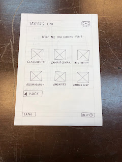
Exercise 2: User Interface (Information Kiosk)11.04.19 (Week 2)
We were given a task to design a information kiosk about Taylor's University. We had to think of our target audience and a scenario to navigate their way to a certain place in campus.
Our group decided to go with walking to the Enrolment and Admissions. Our target audience is to returning students. We needed to think of an easy way for them to find what they want in the user interface. The scenario that we chose for this kiosk is a Design School student trying to get to the class that we're currently in which is E1.08.

Fig 1.0 Landing Page

Fig 1.1 Choose user option

Fig 1.2 Option categories for students

Fig 1.3 Under "classrooms"

Fig 1.4 Final details - details of classroom shown and location pinpointed
WEEK 1 Mr.Shamsul said that our chosen blogs were good and the explanations were good
WEEK 2 Mr.Shamsul liked our Kiosk. He said that it was simple and straight to the point.
WEEK 3
REFLECTIONS
EXPERIENCE
WEEK 1The class was quite interesting. I was looking forward to the upcoming classes although the class today was quite dull since all we did was search up websites and compare them.
WEEK 2I had a very fun class today as we got to work in a group to create a kiosk. Although the planning part was a bit messy, executing the plan was pretty successful and its was enjoyable to see the final outcome presented by everyone in the group.
OBSERVATIONS
WEEK 1I observed that this module requires a lot of research and trial and error to see what works.
WEEK 2I observed that most of our group members were very helpful and some were too quiet and did not contribute much. Working in groups are tricky as there are so many different kinds of personalities.
FINDINGS
WEEK 1I realized that when it comes to determining good and bad websites, we have to use certain terms and phrases to describe the websites as it is crucial for the module. I also realised how much interest I actually have for this course.
WEEK 2
I realized that with so many members in a group, I have to be very patient and have to adjust to different personalities and it was not easy to deal with everyone's comments and opinions and while some are good at compromising and understanding of other group members thinking, others simply are a bit difficult to deal with.
FURTHER READINGS
WEEK 1
Top 10 Guidelines for Homepage Usability
by Jakob Nielson

The homepage is the most important page on most websites, the page that gets more views than any other page. It is your company's face to the world. Most customers look at your website before doing business with you. Therefor, it is important to have a homepage design following strong usability guidelines. Following are ten things you can do to increase your homepage visibility and enhance the business value.
Make the sites purpose clear: Explain who you are and what you do.
1. Start the page with a tagline that summarizes what the site or company does.
2. Begin the title with company name, followed by a brief description
3. An about section to group all corporate information in one distinct area
Help users find what they need
4. Homepage should offer clear tasks
5. Include a search or input box
Reveal Site Content
6. Show some of your best and most recent content
7. Start each link with a relevant word
8. Keep a short list of recent features on the homepage with links
Use visual Design to enhance Design
9. Users often dismiss graphics as ads, therefore do not over format critical content
10. Show photos of real people actually connected to the topic, use meaningful graphics
WEEK 2The 12 Do's and Don'ts of Web Design
Adobe Blog
Do's of Web Design

When designing websites, making your design useful and enjoyable is your top priority, which could be overwhelming for a new beginner. There are Do's and Don'ts for web designing.
Do's include keeping your interface consistent. The overall look and feel your website should be consistent across all your site pages. There must be consistency in, color, typefaces and style of writing.
Another do is, designing easy to use navigation. Keep top level navigation for essential navigation options. Limit it to top-level navigations. Keep it max of 7 options. Remember the three click rule.
Change the color of visited links to make it easier for users to see past and present locations. Also make it easy to scan your pages. Users are more likely to scan the page rather than reading, so a designers job is to create visual hierarchy to the arrangements of elements in a way that implies importance.
Avoid walls of text. Put more visual weight on important elements, such as call to action button or login forms. Well designed websites typically lay out their content in a 'F" reading shape or "Z" reading shape. Stick to a grid layout.
Make sure the text on the website in relevant.
Check your websites for errors. Watch out for dead links and check your websites for typos.
Minimize the number of choices. The more choices they have the less action they take.
Engage the users to scroll. Scrolling sends users deep into the page and makes them invest more time. However, what appears at the top sets the impression and expectation to scroll further.
Label buttons according to what they do.
Make your site responsive to all types of screen sizes.
Make your site responsive to all types of screen sizes.
Comments
Post a Comment